Thought leadership
How we built a brand we hope you’ll never notice

Jeffrey Gardner
June 22, 2026
•
10 min read
If Netflix had called itself "DVD Flicks," what would that name have meant once streaming arrived? That question sums up the problem we set out to solve. How do you build a brand that lasts when the technology underneath it is still changing? And balances the tension between when our brand leads and when it supports those using our platform.
My name is Jeffrey and I joined Miris last fall as a Principal Brand Designer. When I arrived, the Miris brand had been built in response to what Miris needed to date, not what Miris is (or was becoming). Miris had inherited much of our design language. An external agency created the original logo and first website. That work helped Miris recruit engineers, establish credibility, and build a presence while the product took shape. But relying on an outside agency for core brand and website execution limited speed and flexibility. It was never designed to scale.
Theresa Smith, our Design Director of Product, had already made meaningful progress. She had completed competitive analysis and user research. Bryan Saftler, our VP of Marketing, was leading a full brand and website audit that sharpened the case. Several businesses in the market were using logos uncomfortably similar to ours. The visual language had evolved in increments, not through a deliberate, scalable system.
Rather than continue with incremental fixes, Bryan asked us to step back and rethink the brand from first principles:
If Miris had no brand, considering what we now know about our customers and the problems we solve, where would we start?
To answer that, we had to be honest about what Miris was becoming. Our technology lowers the barrier for teams that want to put high-fidelity 3D into their experiences, the way you'd use video today. You don't upload five versions of the same video to YouTube to optimize for different devices and connections. You upload your highest-quality file, and YouTube handles the rest. That's what Miris does for 3D. The hard parts (speed, fidelity, scale, and cost) happen behind the scenes so that teams can focus on the experience and not the pipeline.
That realization mattered because a brand built around ease of use should behave the same way our product does. It should get out of the way. Three guiding principles emerged: Infrastructure, Visibility, and Kinetic Feedback.
What does Miris exist to do? We exist to easily collapse the distance between 3D content and the people experiencing it. This distance matters because when content feels tangible, it earns trust, drives connection, and invites interaction.
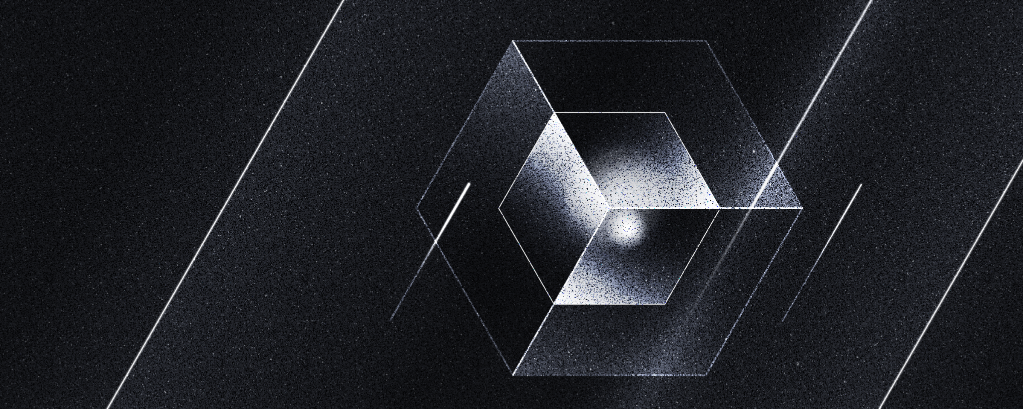
Our original logo used a dot-grid pattern referencing Gaussian splats, a 3D rendering technique.

That idea may work well today because splats are relevant and, in some technical circles, are recognized immediately. But technology formats are bound to change, and we needed the logo and mark to be able to navigate those changes. Instead of tying our brand to something likely to change (a rendering format), we chose to represent what we are.
Miris is infrastructure, delivering 3D content across devices at internet scale.
Infrastructure comes in all shapes and sizes. If we knew the kind of infrastructure Miris is closest to, it would ground our decisions in something relatable. In our process of brainstorming, what came to mind were pipes, power cables, Wi-Fi, and tunnels. The kind of infrastructure that's at its best when it's hidden, or even invisible.
Theresa named this principle early in our conversations:
"We are at our best when we elevate our users. We stay transparent where it matters, meet people where they are, and let their 3D content lead the experience."
As I started building blog images, social ads, and other collateral, I realized we needed to consider when the brand was to take center stage versus when it needed to be a supporting character. What happens when we're designing a piece that doesn't feature a customer? A social ad promoting our latest ebook needs a cover with a loud gradient burned across the front. There are real moments when Miris can't be invisible.
Luckily, some infrastructure is visible: bridges, lighthouses, dams, and monuments. They are built to be seen and stand on their own. Our first principle says Miris is infrastructure. Our second principle, Visibility, identifies which kind of infrastructure we should be in a given moment (invisible or visible), and that informs how Miris behaves.
We think of it in terms of distance. We want our customers' content to be the hero, and when that's possible, we recede. When Miris needs to stand on its own, we step forward. The distance always depends on who's looking.
We needed a guiding principle for how the brand looks, because knowing when to show up is one thing, and arriving in style is another. Unlike photos or videos, 3D content invites interaction. It's the closest digital medium to actually touching something. Our brand language needed to show that.
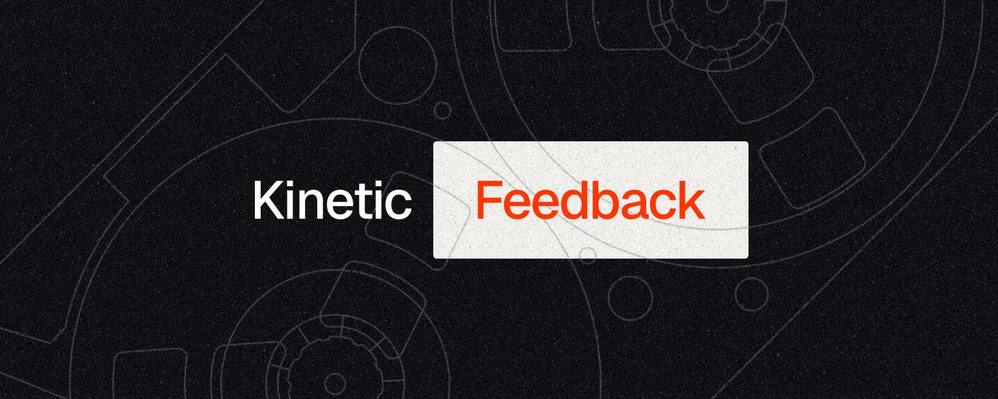
I named our visual system Kinetic Feedback, and it shapes our aesthetic decisions: the textures we use, our illustration style, our colors, and the references we draw inspiration from. It's guided by a belief that digital experiences should feel as real as physical ones.
Kinetic Feedback draws inspiration from the 1960s through the 1980s, an era we define by its artifacts: VCRs and gaming cartridges (the kind you had to blow into before they worked). You held them. You pressed play. When you pushed a button, you could feel it push back. We reference this era not out of nostalgia, but because it represents what we're bringing back: the feeling that content isn't just distant data, but something in the palm of your hand.
That period was also a transition, when the physical world was rapidly becoming digital. Today, we face the opposite transition, but the uncertainty feels the same. Many of the brands that navigated that era, like Paul Rand's IBM and Saul Bass's AT&T, used logos that conveyed stability and reliability. Those are essential attributes if we expect customers to trust Miris with delivering their content. We needed a mark that reflected those principles at a glance, before a customer ever read a single line of copy.
Logos in the AI and tech world are drifting toward uniformity. The circular tropes and spirals have had an unfortunate effect, with many marks feeling interchangeable today. My goal was to avoid that. I initially explored 30 or 40 variations that retained some form of the repeating dot pattern and "splat" elements from the original mark. Nothing felt original.
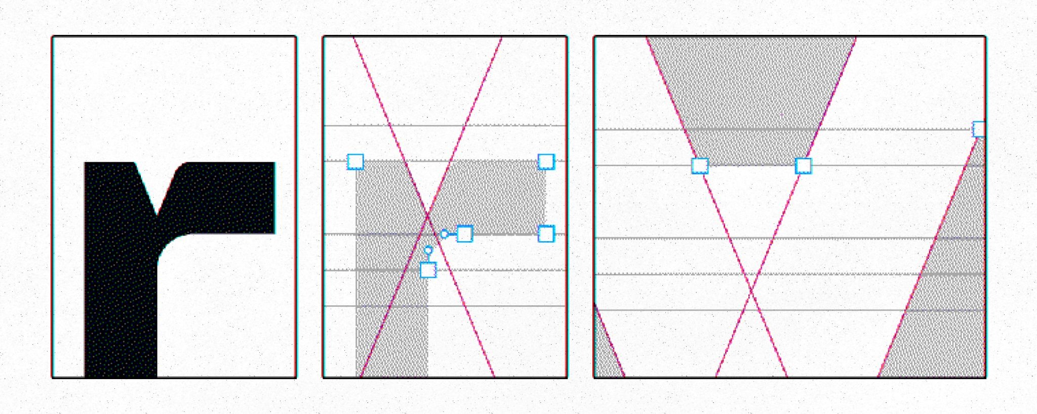
Leaning on my research into IBM and AT&T, I built the mark from four chunks. Each one shares the same angled edge. The negative space between them creates an M. If you look at it sideways, the shapes read as the cross-section of a trench, and the M becomes the channel where content flows. A visual metaphor for our delivery infrastructure. This framing was vital to others' understanding of the reasoning behind the design and ultimately led to its approval.
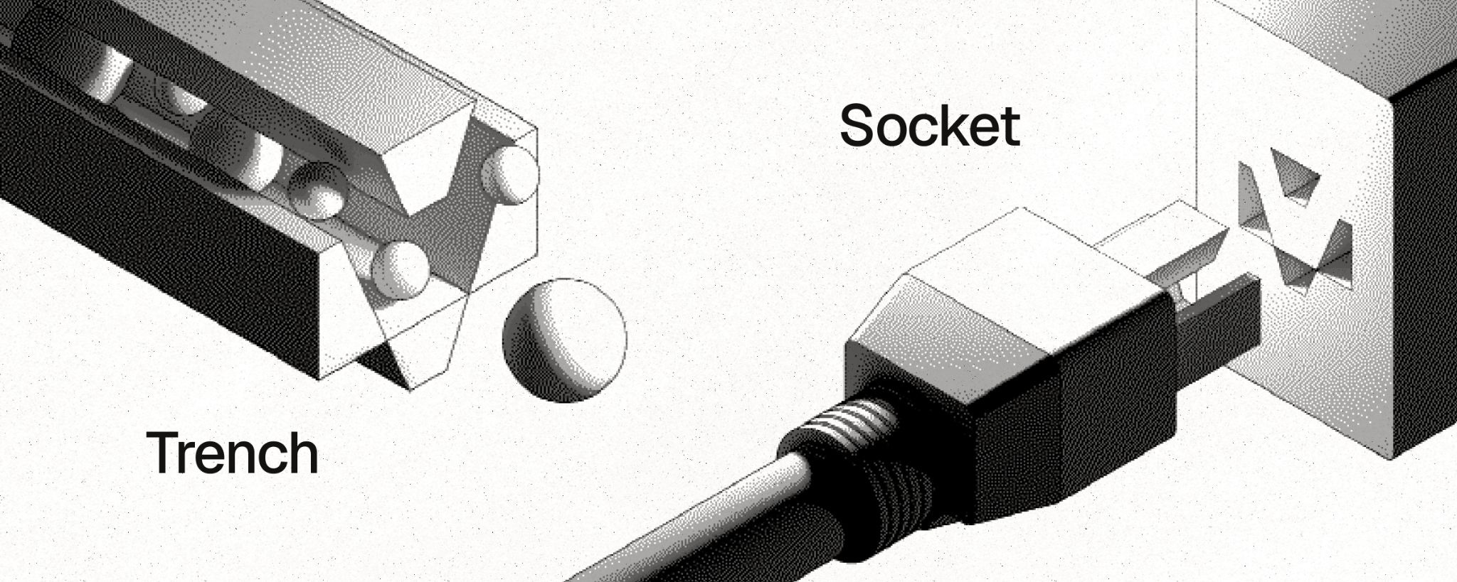
If you look at it head-on, the chunks resemble the face of a power outlet, the points where contact is made. I call it the socket. Both the sideways and head-on perspectives land in the same place. Miris is infrastructure, and the M is where things connect.
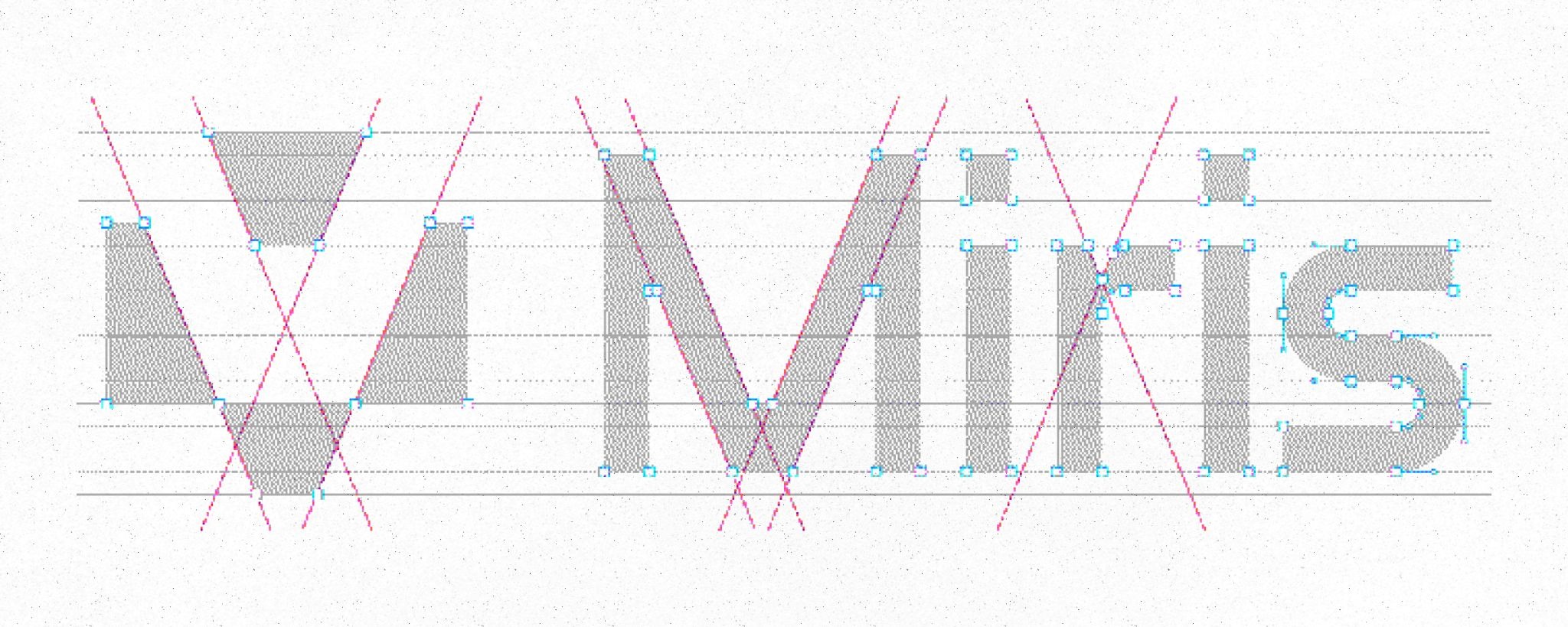
To complement the mark, I designed a custom wordmark. The challenge was striking the right balance: interesting enough to stand on its own, but not so interesting that it stole focus from the mark. To create a cohesive logo, I matched the letterform angles to those in our four chunks. The smallest geometric connection is the notch cut into the "r".

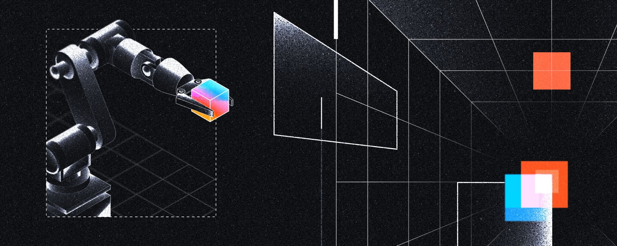
When people hear you're designing a brand for a 3D company, they often assume the visuals should be hyper-dimensional and complex. I chose a different approach. If our brand relied heavily on flashy 3D assets, they would compete with our customers' assets. The visual hierarchy would collapse, and our ability to elevate 3D content would be lost. Our surfaces and illustration style are intentionally restrained. Two-dimensional lines. Minimal shading. Technical perspective.
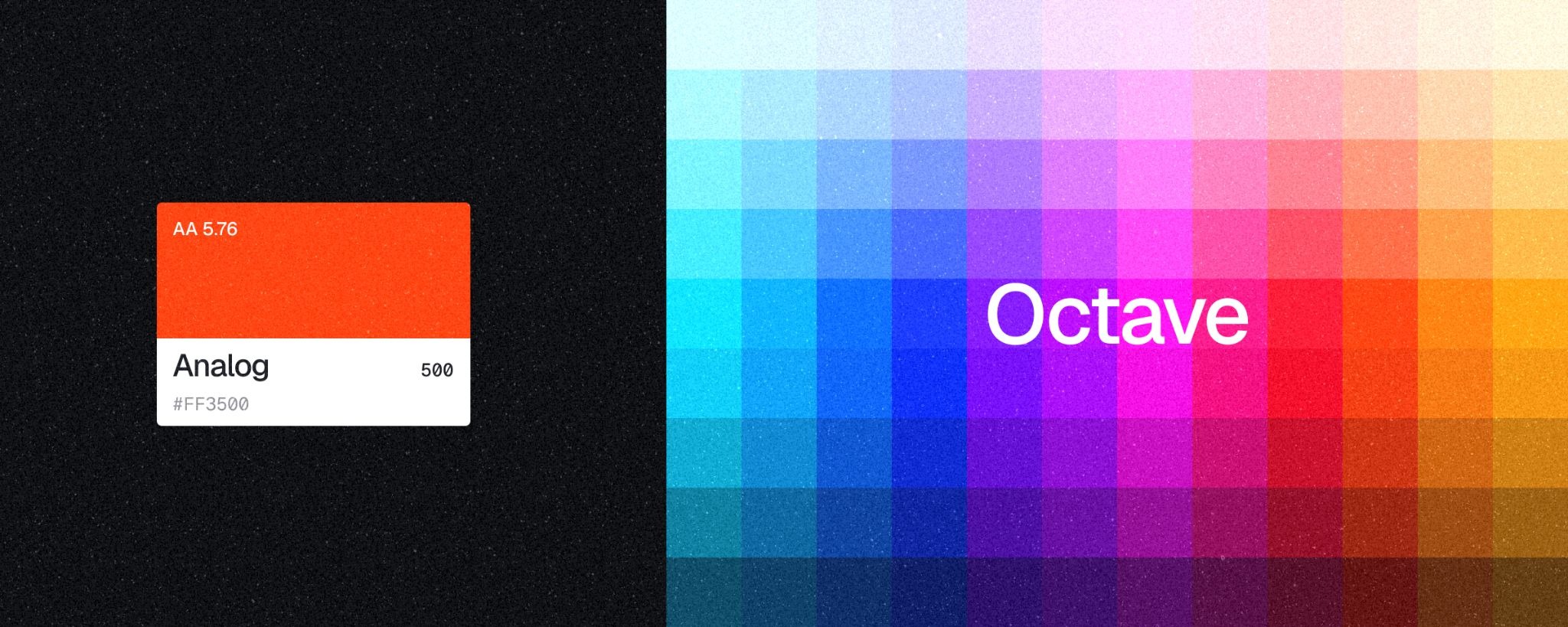
Before I was hired, the team's early color research had explored several directions. That research became the starting point for what I would later term the Miris Octave. It consists of twelve hues stepping around the color wheel from cyan to amber, deliberately crossing red. Each family takes its name from the artifacts Kinetic Feedback draws from. Cassette, Cartridge, Scanner, Transistor.
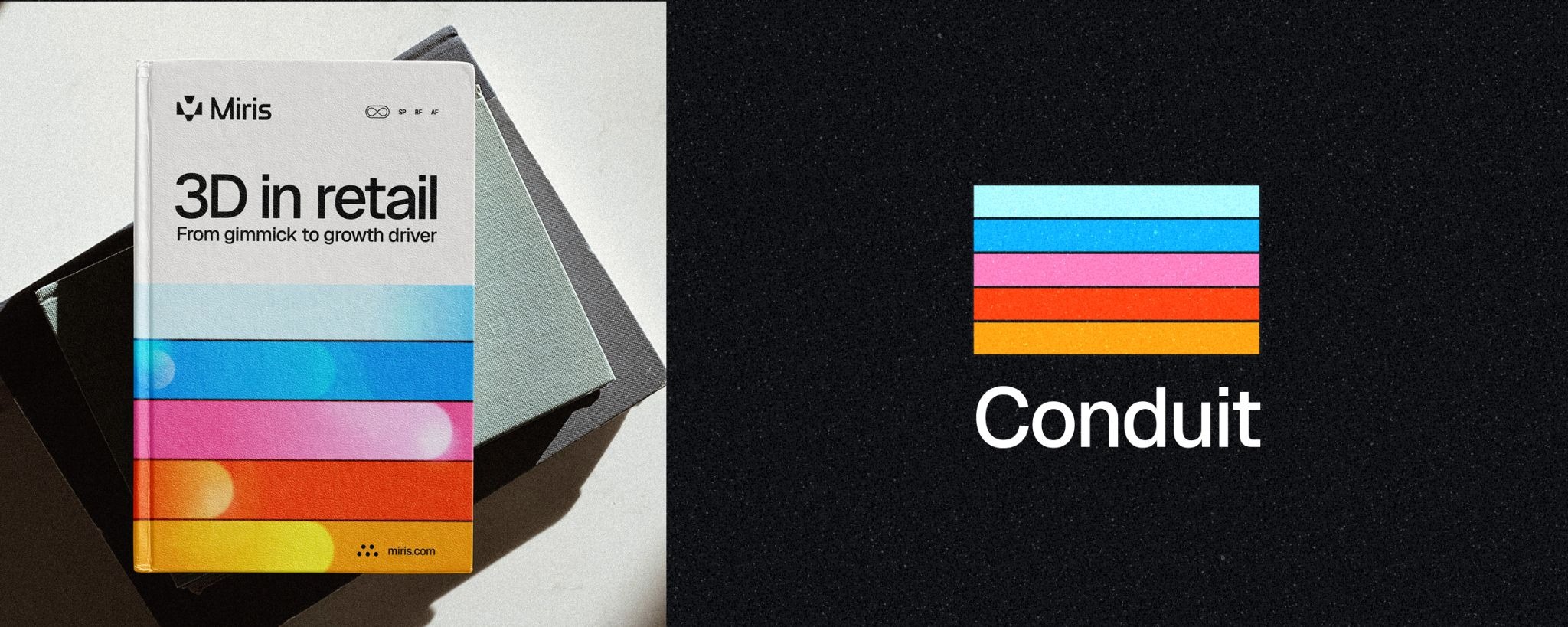
The Octave is our full palette, and we like to call it our color playground. But we needed something more focused, so I created the Conduit, five specific Octave colors chosen to represent content flowing through our infrastructure. If our logo M is the channel, then the Conduit is the visual representation of the content that flows through it.
The foundation of our color system is rooted in black, white, and shades of grey. We named this Mono, short for Monochrome. Our Visibility principle informs our use of color. When 3D assets are present, or when we are highlighting a specific partner, we use Mono. This principle gives the appropriate distance so their content can take center stage. For those moments when Miris needs to stand out, we incorporate our Octave colors, whose vibrant hues pull us forward.
We've watched technology companies rebuild their identity systems every 18 to 24 months. We wanted something more durable: a brand rooted in infrastructure, designed for longevity but built to adapt.
Our foundational principles, Infrastructure, Visibility, and Kinetic Feedback, are the framework for making decisions. The outcomes of those decisions are the logo, the Octave, and our illustration style. As Miris evolves, our brand can too, because we are anchored by principles that bend rather than a rigid set of rules.
So the question we ask ourselves is, did we succeed in building an invisible brand? One day, as you're shopping for a new pair of shoes, a handbag, or your next car, in beautiful streaming 3D, I hope you never realize it's Miris delivering that content. That's when we'll know we've built it.